Whoa it has been seven months since my last blog post and so many things has happened I can not keep up. I’ve met so many great people, I worked on great projects which I am hoping to share on my website soon. For now this is a sneak peak of one of my projects I am currently working on which I can not resist to put up straight away. i’ve changed the name as I can to reveal the name as yet but it’s a cosmetics brand design identity where we create a customised lettering for the logo and use some great typography for the packaging. The logo is my favourite, it’s romantic yet minimal and clean, modern and chic. I included a moodboard and few simple mock ups with the logo. I just can’t stop looking at this…I love it and I hope you will too.


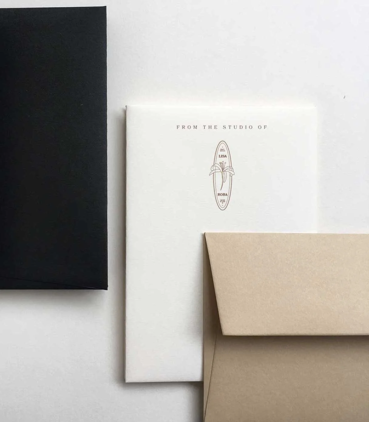
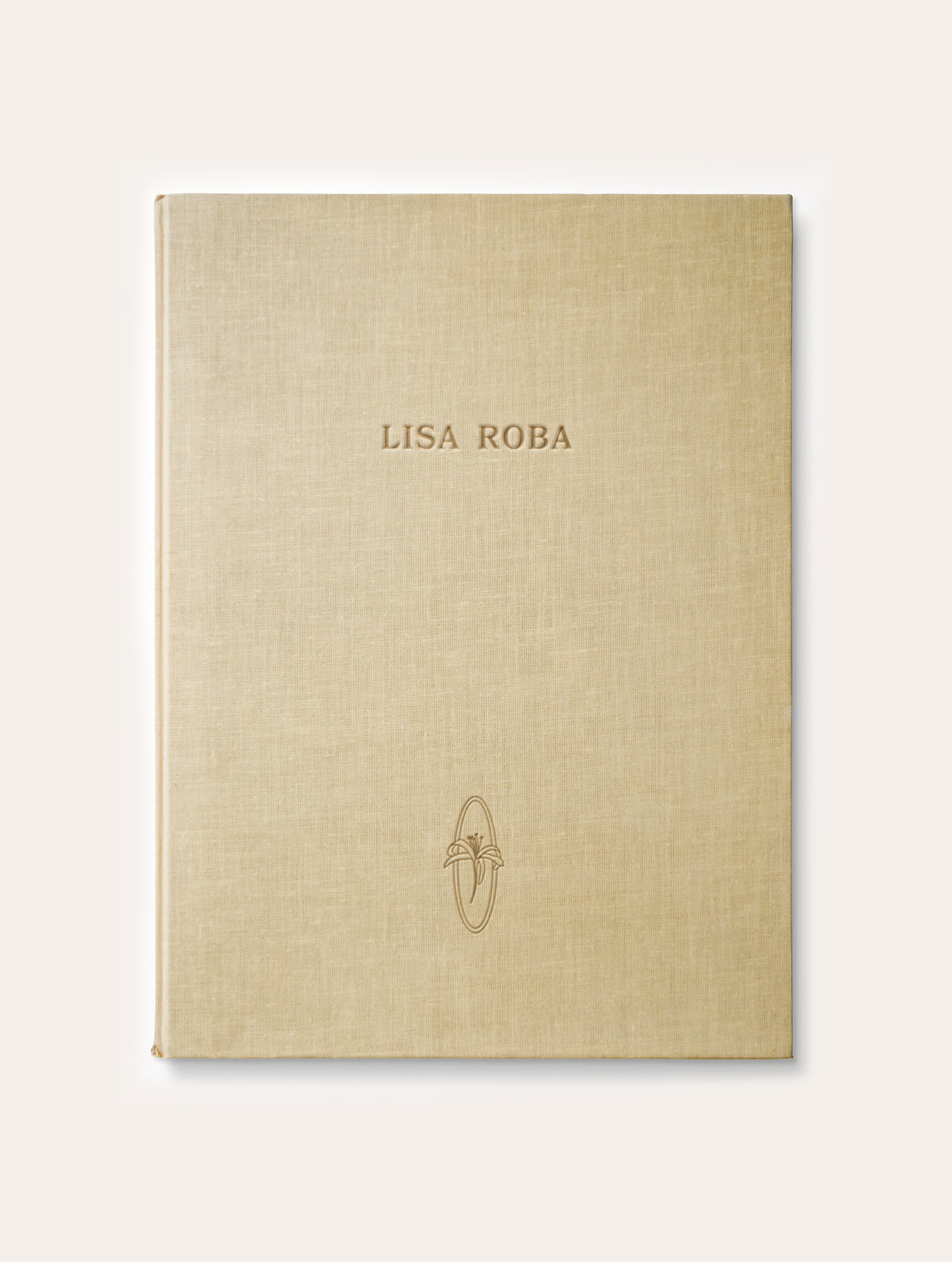
Latest Work: Lisa Roba
Lisa Roba is a wedding stylist who wanted to create a simple and minimal brand identity that would reflect her style and aesthetics. We created a fresh wordmark and a noble symbol in a style of Art Deco with a flowery illustration. Here are little snippets of the final product design and the inspiration for the brand from @megganroussel, kamperett.com and pinterest.


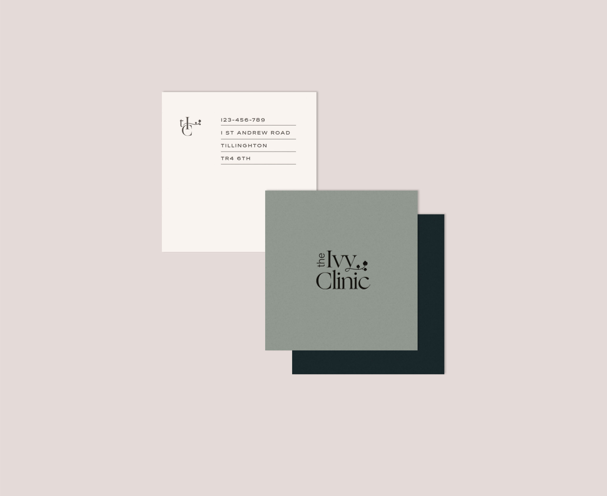
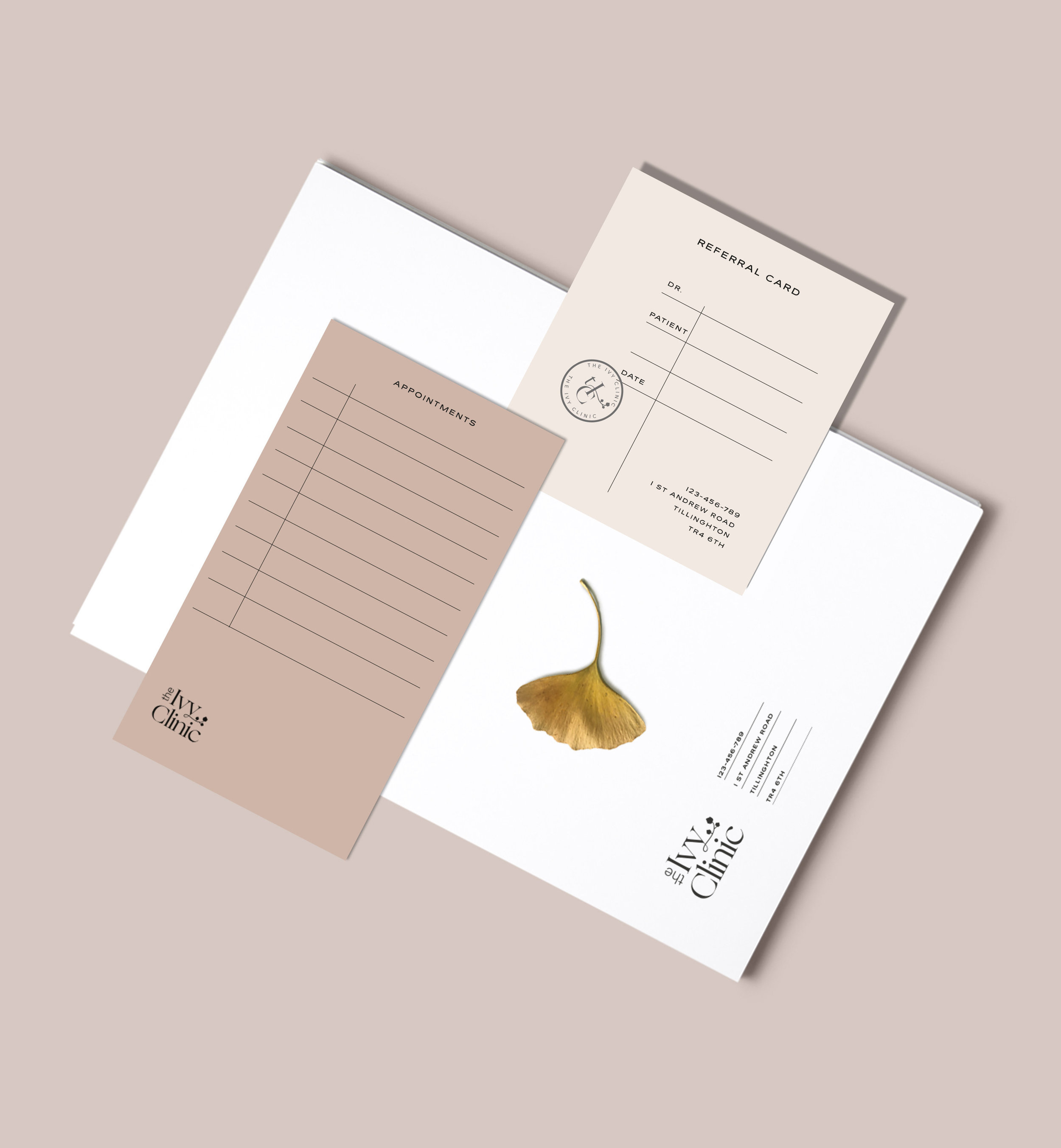
Latest Work: The Ivy Clinic Brand Identity Design
I am super excited to introduce the newest addition into the portfolio- A brand identity concept for an all inclusive beauty clinic that wanted to do things differently. The objective was to create a brand that's minimal to reflect the purity of the business' nature but also friendly and welcoming at the same time. We all know the often portrayed sterile clinic aesthetics that no matter how we look at it brings an unwelcome memories of our visit to the dentist. Well, that's exactly what the folks at Ivy Clinic wanted to avoid and change. They wanted to move with times and show their brand as modern, fashionable and above all warm and inviting. I hope you enjoy this dreamy palette and minimal aesthetics this branding has to offer.
xoxo


Latest Work: Hair2Stay-Brand Identity Design Concept
Whoa, I cannot believe it's been so long since my last post. It's been super busy here at LOOLAA and I am excited I finally started gathering all my work into a shareable formats so I can share with you loads more often.
I am super excited to introduce this beauty brand identity concept for a hair salon. This concept happened during a brainstorm session for a new brand identity for my dear friend Sam Sriumpai and her mum's hair salon. Sam and I really loved this concept however we thought something more traditional and cultural would suit her mum's brand a bit more. (coming into my portfolio soon)
I decided to share this concept as it's super edgy while still trustworthy and comforting which was the objective of the brief. The idea for this concept has been inspired by the chinesse aesthetics. Long elegant lines idea taken from chopstics and turned into friendly floating shapes portraing hair from a different perspective. The line forms together with patterns bring harmony, wisdom and comforting feel to the brand's character.
And so it shall live here in my little cyber space.
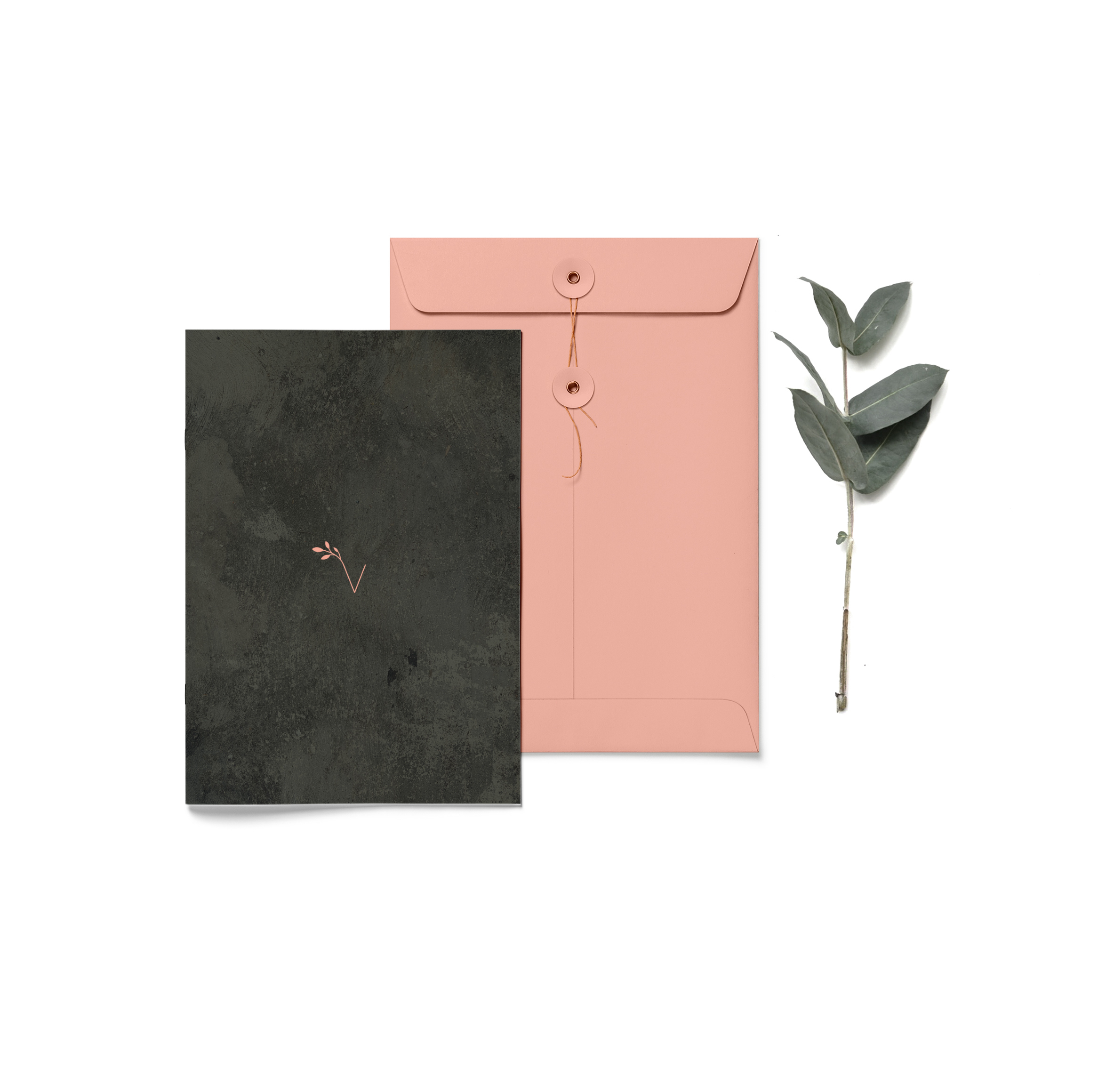
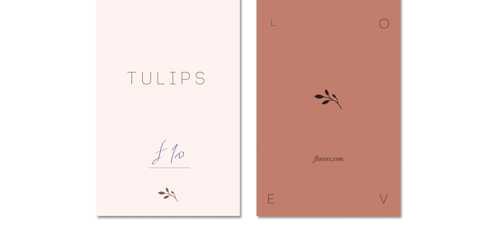
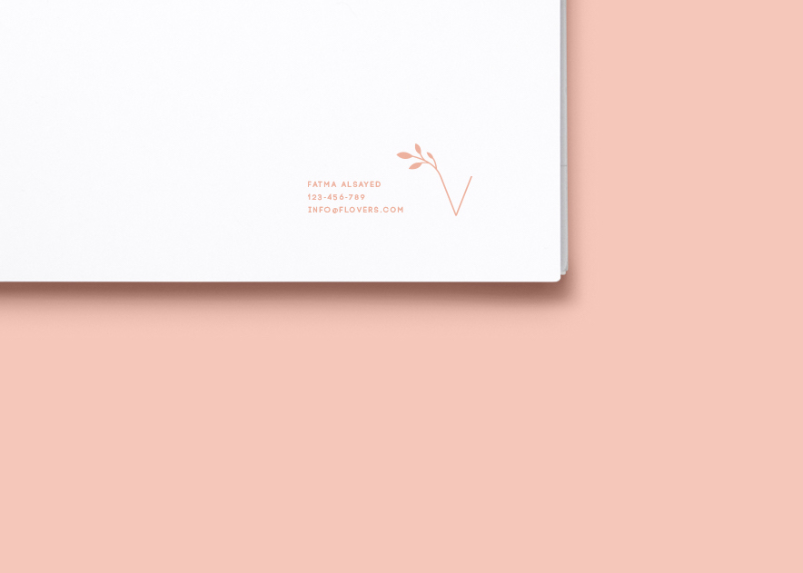
New custom Identity - Sneak Peak
It's been ages since I last posted here and no I haven't been in Amsterdam this whole time, but I can not wait to share the snaps of our wicked trip.
It's been quite busy here at Loolaa Designs in the past few weeks, working on some exciting projects. One of them been a custom brand identity for a flower shop and I just could not wait till it's finished and had to share with you a little sneak peak now. It's just few snaps of a brand that's very delicate and elegant. It's earthy colours and choice of humbled font give sense of calm and friendliness portraying the love of flowers and their mighty language. Enjoy x